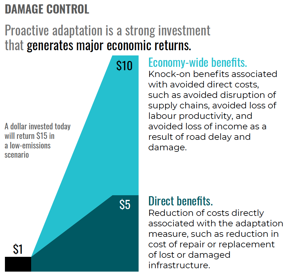
Data visualizations
See our summary report for context. All text and graphs are Creative Commons licensed and free to use with attribution.
Figure 1
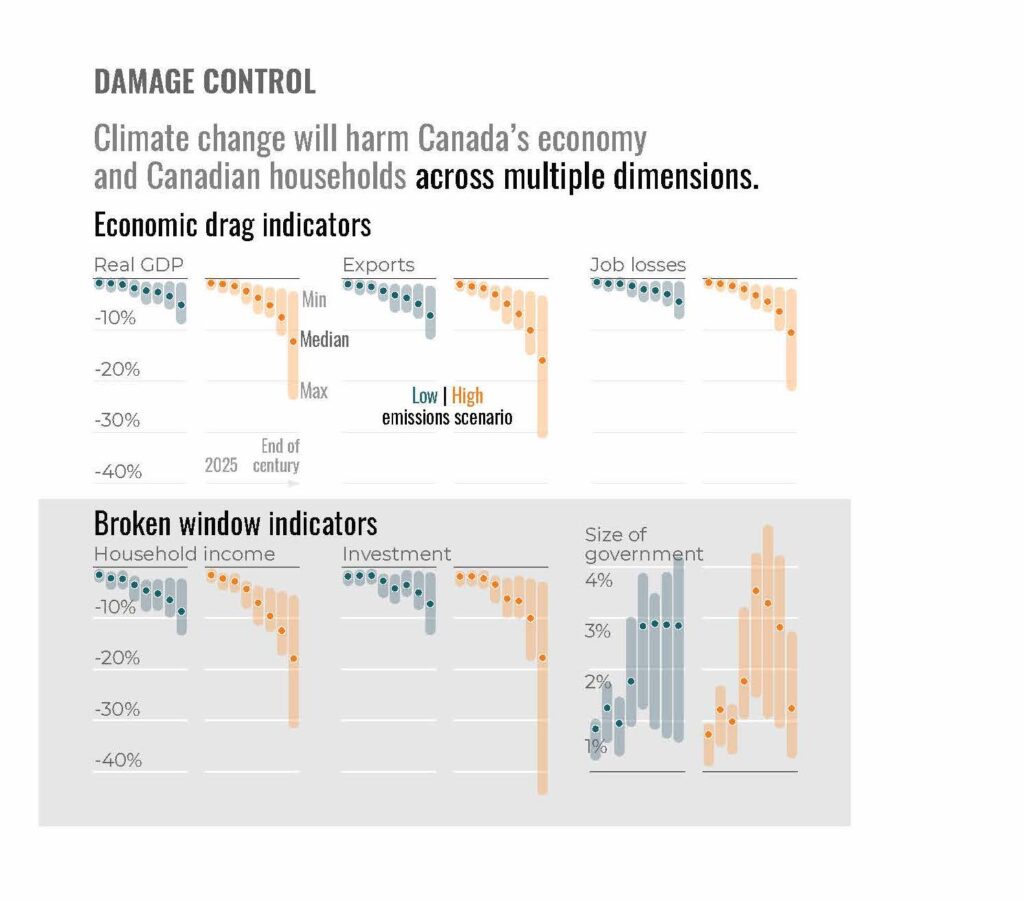
Figure 2
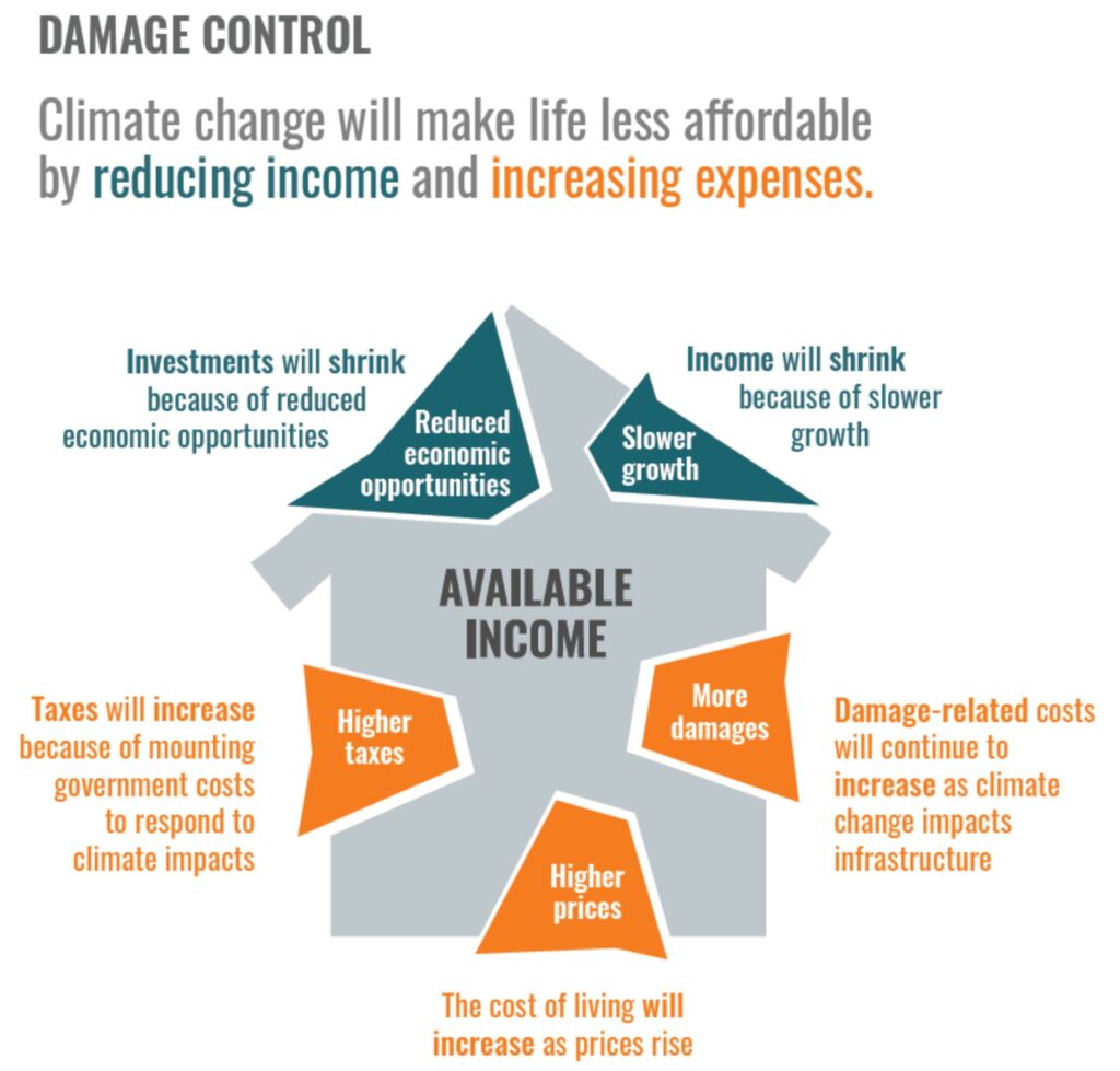
Figure 3
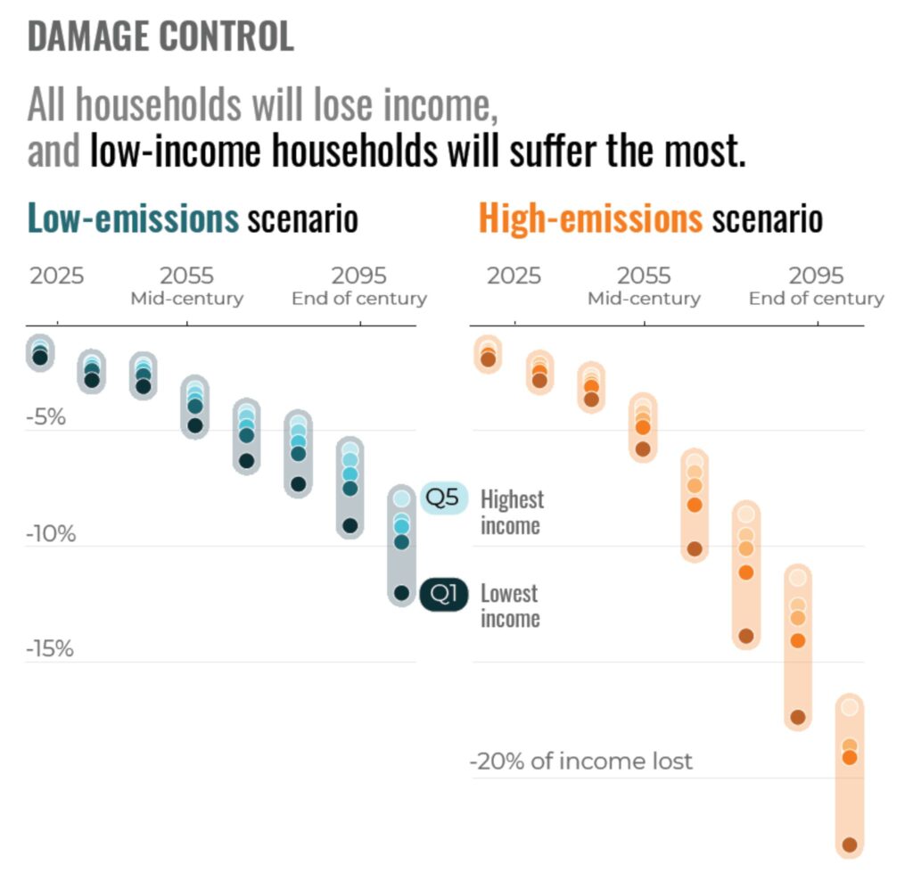
Figure 4
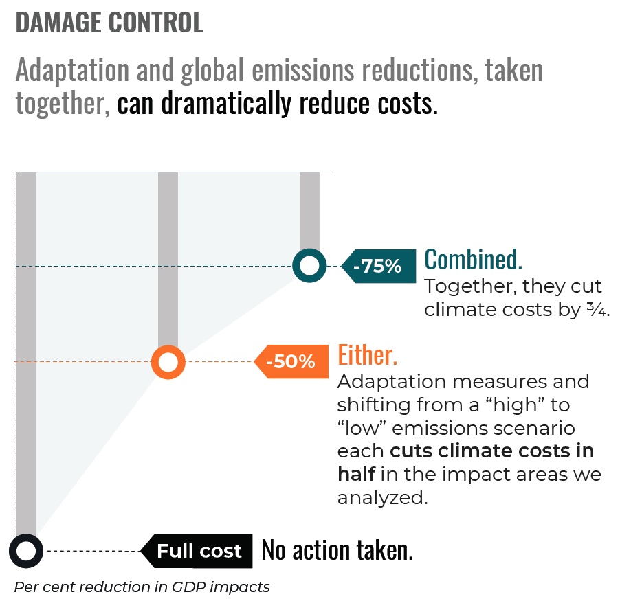
Figure 5
See our summary report for context. All text and graphs are Creative Commons licensed and free to use with attribution.