See our summary report for context. All text and graphs are Creative Commons licensed and free to use with attribution.
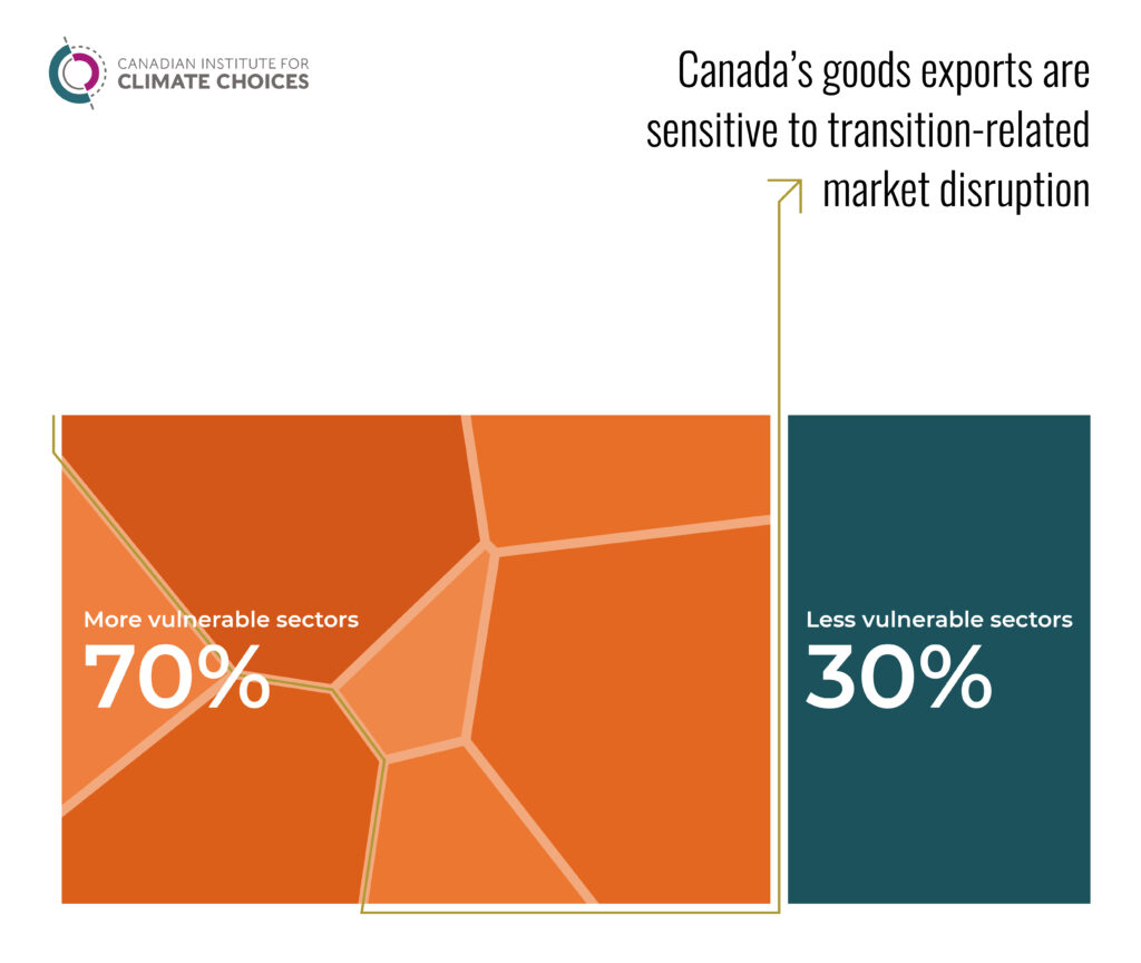
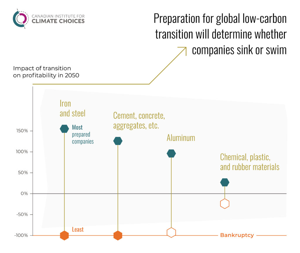
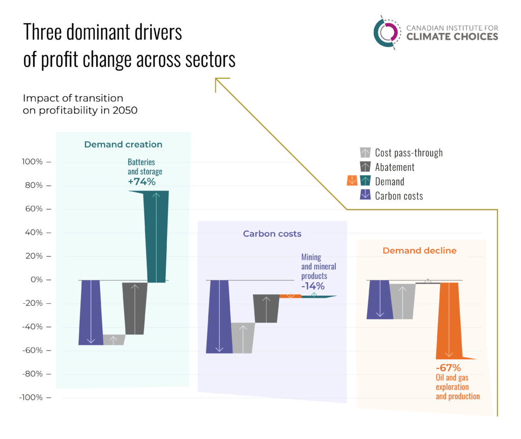
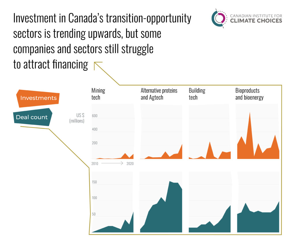
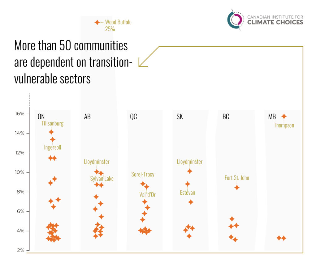
Source: GAC (2020). Notes: This figure shows the per cent share of the value of Canada’s goods exports in 2019, by product. Nearly 70% of Canada’s goods exports—including energy products, motor vehicles and parts, metal ores and non-metallic minerals, and basic and industrial chemicals—are in global markets expected to face disruption.Source: Analysis by the Canadian Institute for Climate Choices (2021) based on data from Statistics Canada (2016a). Notes: This figure shows the share of the workforce directly employed in transition-vulnerable sectors by province and territory. The size of each square represents the share of workers in transition-vulnerable sectors relative to each province and territory’s total workforce. The size of polygons within each square illustrates the share of workers within individual sectors. Emissions-intensive manufacturing includes NAICS codes 324, 325, 326, 327 and 331.Source: Canadian Institute for Climate Choices (2021c), based on modelling and analysis commissioned from Planetrics. Notes: This figure shows the difference in profitability between the baseline scenario and the immediate 1.5-degree scenario in 2050. It compares the performance of the bottom 10 per cent of global equities in a sector (bottom node) with the performance of the top 10 per cent of global equities in a sector (top node). It illustrates that sector average results do not necessarily represent the performance of individual companies through transition.Source: Canadian Institute for Climate Choices (2021c), based on modelling and analysis commissioned from Planetrics. Notes: This figure breaks down the major drivers that determine the future profitability of companies through low-carbon transition. It shows the decomposition of the difference in profitability between the baseline scenario and the 1.5-degree scenario for a selection of sectors in 2050, based on all equities operating in the Canadian market. Results are similar for Canadian equities operating in the international market, though fewer companies and sectors are captured.Source: Analysis by the Canadian Institute for Climate Choices using data from PitchBook (2021). Notes: This figure shows the total capital invested across nine transition-opportunity sectors in US dollars and the number of completed business deals (i.e., investment transactions). Values include private equity, venture capital, corporate and strategic mergers and acquisitions, initial public offerings (IPOs) and liquidity, and debt. The analysis captures businesses that are primarily focused on the relevant technologies, products, and services in each sector. More detailed analysis on each opportunity is available at https://climatechoices.ca/reports/sink-or-swim. Data is drawn from a custom search and has not been reviewed by PitchBook Analysts.Source: Analysis by the Canadian Institute for Climate Choices based on data from Statistics Canada (2016d). Notes: This figure shows census metropolitan areas (CMA) and census agglomerations (CA) that have more than three per cent employment in transition-vulnerable sectors. Communities within each province and territory are plotted according to the total share of their workforce within a single transition-vulnerable sector. Some communities appear twice, illustrating that they have a concentrated workforce in multiple transition-vulnerable sectors. For example, Wood Buffalo in Alberta has 25 per cent of its workforce employed in oil and gas extraction, and four per cent of its workforce in related support activities for mining and oil and gas extraction.